Getting started with the Picture element

Responsive web design is awesome. It's changed the way we serve content to our users and has allowed us to offer a tailored experience to different screen sizes. It is really flexible and with a little bit of knowledge, anyone can get started. While this flexibility is great, it can also have a negative impact on the performance of a web page if not used correctly.
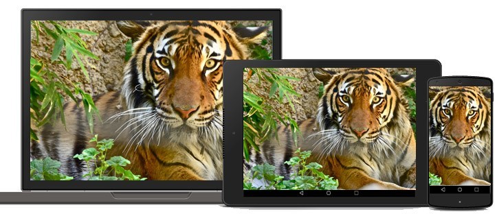
Serving an image that is made for a desktop website is often too large for a mobile device. As we know, large images weigh more and can degrade your page load times on a mobile device. Whilst using responsive design and fluid images may appear visually correct, larger images can lead to a drastic reduction in web page performance. Tim Kaldec's research into responsive images has suggested a responsive images strategy could lead to savings of up to 72% on image weight. 72%.....Woah - That's a huge saving!
Over the years, there have been a few tricks that developers have used to try and work around the responsive image dilemma, but they all seemed a bit hacky - until now. This is where the picture element comes in.
Already part of the WHATWG's HTML spec, the picture element is a client-side solution for delivering image data based on device capabilities. In order to understand how powerful this is, let's take a look at a basic example.
The browser will interpret the HTML above and choose an appropriate image for the viewport width based on the options supplied. In order to see a demo of the HTML in action, please follow this link.
If you look closely at the HTML above, you will notice that each picture element is made up of a set of source tags. Inside these source tags, you can specify the device viewport width and the appropriate image that you would like to display. Browsers can then use this information to pick the best image source. It's great because all of the work happens client side, giving developers control of the images that are presented to the user.
It's also worth mentioning that the same effect could have been achieved using the srcset and size attributes on an image tag. The srcset and sizes attributes extend the img and source elements to provide a list of available image sources and their sizes. Browsers can then use this information to pick the best image source. If you don't need art direction in your images, this option could work for you.
If you're interested in learning about the history of the picture element and how it all began, I recommend reading this article.
Processing your images
The picture element is great for web page performance and gives us loads of flexibility, but what about creating all these different image sizes? If you need to keep two or three copies of your images, how do you go about processing them according to size? Fortunately there is actually a simple solution to this. Using the Grunt responsive images plugin, you can process and size all of your images automatically. If you aren't familiar with Grunt tasks and how they fit in with your development workflow, I've previously blogged about them. The Grunt website is also a great resource that will show you how to get started in no time.
Once you've got Grunt setup and running on your machine, simply navigate to your website and download the package by typing the following in your command prompt.
npm install grunt-responsive-images --save-dev
You will also need to install a copy of either ImageMagick or GraphicsMagick command line tools. Next, you will need to set up your gruntfile.js file. Below is a basic example of what your file could look like. There are different configuration options available and you can set them according to your requirements.
The file above will output each image size to a different directory based on its width. I have set it to cut the image at 320, 640 and 1024 pixels.
Finally, process the images by running Grunt in your command prompt and you should notice 3 folders with resized images in them. Hooray!
If you are looking to automatically generate the associated HTML markup for your images, there is a Grunt plugin that will do all the hard work for you. If you combine these two plugins together you will have a solution that will make magic happen for you!
Older Browsers
As with any new browser feature - you always have to keep older browsers in the back of your mind. Currently only Chrome 38 and Opera support the picture element. But there is good news, the picture element has been formally accepted by the WHAT working group and will start to appear in all modern browsers in future releases. If you would like to see if your favourite browser is supported, check out caniuse.com.
Fortunately, there is a polyfill that you can use today that will work across most legacy browsers. The team over at Filament Group have created picturefill.js, which is a polyfill that enables support for the picture element and associated features in browsers that do not yet support them. This means that you can start using the picture element today!
In order to use the polyfill, you need to include this JavaScript file in your page.
Once added, it will act and behave just like the picture element. If you'd like to checkout a demo of all of this in action, please follow this link. There is also a great list of demos available on the Responsive Images Community Group website.
Side note
When I first started using the picture element, I saw the following error appear in the console of my developer tools.
"
The console error is pretty self explanatory and once I stopped using src to point to a resource, and switched to srcset it immediately started working!